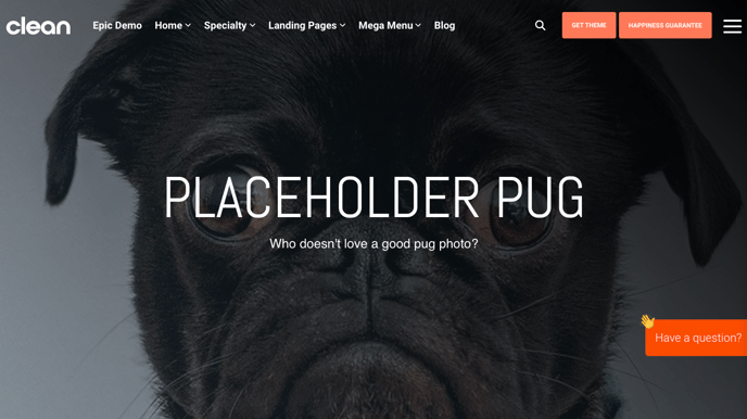
The hero banner uses a background image that needs to work on all device sizes.
If you've uploaded an image to the hero banner or any of the other CLEAN modules and it's getting cropped like this, you have a few options.
First, let me explain what's going on here.
This background image needs to work on a variety of sizes browser windows and devices.
As the browser window gets wider and narrower it changes the ratio of the container the background image is trying to fill. For example, let's check out this background image on a tablet in portrait mode vs. a larger desktop screen above.
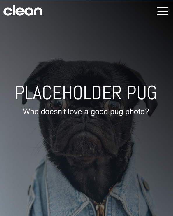
Paul the Pug looks perfect. Because the ratio of the viewable area has changed.
Here are the controls you have to play with.
To get your image looking good, there are a few options you can experiment with in order to get the important part of your image in view.
Background Position:
The very first thing you're going to want to play with is the background-position dropdown. Generally, I like to keep this set to CENTER CENTER, but you can explore the other options.
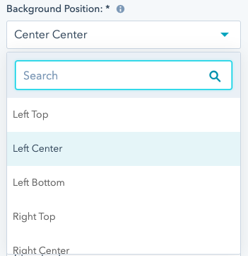
This will allow you to anchor the photo to various sides while still having it cover the entire container.
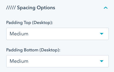
Spacing Options / Padding Top & Bottom
This setting will allow you some control that impacts the ratio of the container by adding more space above and below the content, essentially making it taller or shorter.
Pro-Tip: Avoid having text embedded in a background image
This will undoubtedly result in having some of the text cropped out at various screen sizes and generally not a great practice. Using the rich text module to overlay text on the image is definitely the way to go and will ensure it's always visible.