In this article, I'll walk you through a few key things to know when working with this module.
First things first... You'll notice that there are two Content Card Flipper modules in the CLEAN theme.
- Item - Content Card Flipper: This is a single card you can drag-drop into your layout.
- Row - Content Card Flipper: This gives you the ability to add a full row of content card flippers should you plan on adding more than one.
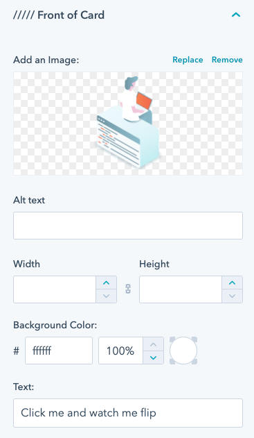
1. Add content to the front of your card(s)
Toggle down the /// Front of Card section and you'll see where you can upload an image and add some text.
Adjusting the default style
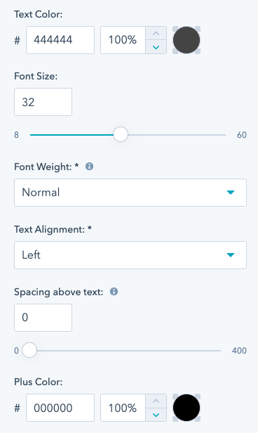
If you want to change the look of the front of the card, I've got you covered. You'll notice right underneath you have a range of style options for the front of the card.
2. Add content to the back of the card
Toggle open the back of the card to access the rich text editor where you can add text, images, video, etc.
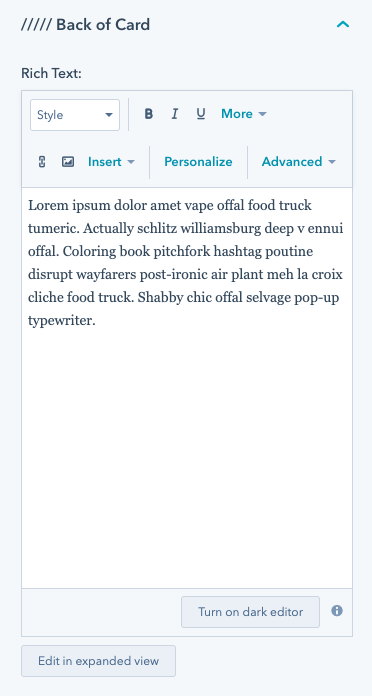
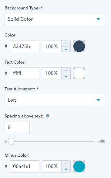
You also have the same sort of style controls.
3. Adjust the height of the card(s)
Now that you have your content added to both the back and front of the card, you can dial in the correct height for the card. If the back of the card has a lot of content and is taller than the front, you'll want to set the height according to the back.
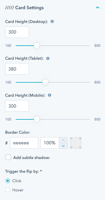
You'll notice that you have the ability to set the card height for tablet and mobile as well. Since your content may appear taller or shorter on those devices, you'll want to set them accordingly.