The Magic Module is designed to be incredibly flexible, allowing you to get extremely creative. Here is a breakdown of the key things you need to know.
Module Status: Beta 0.6
Before jumping into how to use the Magic Module, it's important for you to know that it's currently in a beta release period. For a quick high-level overview of what's included in this new module, you can check out this blog post.
Since this is in a beta version, please report any bugs or feedback you might have here.
Let's cover some quick basics.
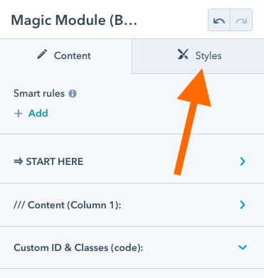
Right out of the gates, one thing that you'll notice is a little different from the other existing CLEAN modules is that the STYLES tab is now available.
Content Tab:
At the risk of being Captain Obvious... It's under this tab where you'll edit the content that's included in each column. You will also find some style properties there as well. It will mainly be specific to the content you've added.
Styles Tab:
It's under this tab where you'll be able to add style attributes to the "containers" that your content sits in. The section, row, and column. We'll get more into that in just a second.
Where you should start (basic gist).
I've done my best to make this straightforward for ya. Jump into the START HERE section.
1) Set the number of columns you want.
Use the slider to set the number of columns you want to include in the row. You'll notice that you can now go up to 6 columns.
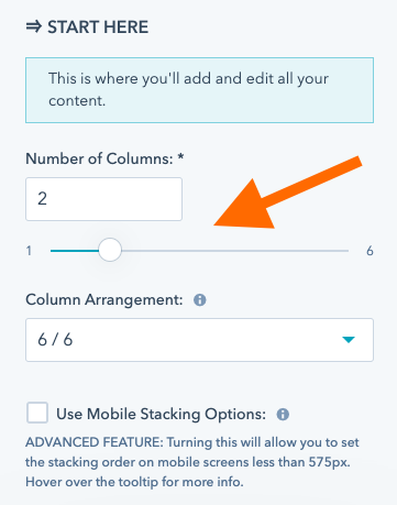
Use the Column Arrangement dropdown below it in order to set the column sizes in proportion to one another. You'll already be accustomed to this from existing CLEAN modules.
We'll get into the Mobile Stacking Options later if you end up needing them.
2) Style the outer containers
Before jumping straight into adding content I typically like to "set the stage" so to speak and do things like set the background, spacing, and various style elements.
Click the STYLES tab to do this.
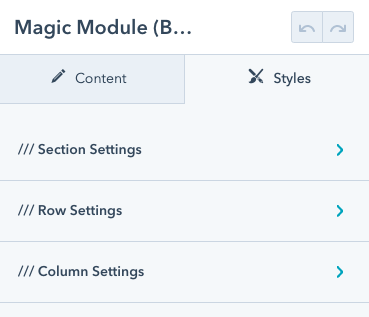
You'll see there are three main things you can edit.
- Section - The outermost container that holds the whole shebang together.
- Row - The container that holds the columns
- Column - The container(s) that hold your content
Are you visual like I am? This may help.
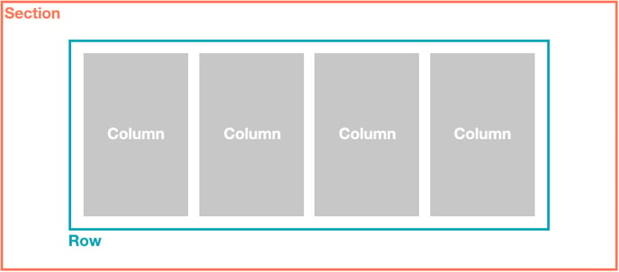
It helped, right? Thought it might. I got you. :)
I suggest starting with the SECTION settings and working your way to the ROW, then the COLUMNS.
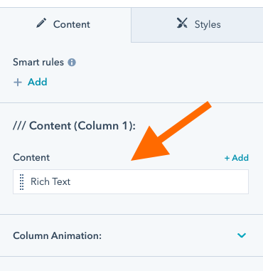
3) Add your content
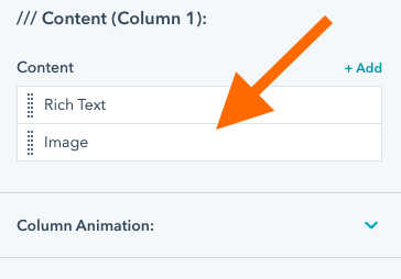
Now you're ready to start adding some content so go ahead and pop back over to the (you guessed it!) CONTENT tab. Then click the column you want to add content to. By default, each column will load with a Rich Text Editor, like this.
Don't you worry! Things are about to get really exciting. With the Magic Module, you can easily add, edit, and order a variety of "content elements".
Here is what you have to choose from:
- Rich Text
- Image
- Icon
- Form
- CTA / Button / Modal Pop-up
- Lottie Animation
- Rotating Text
When adding a new content element you'll be able to select from the following dropdown. Note: Rich text is the default as it's the more widely used option.
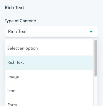
Let's go ahead and add an Image for example sake.
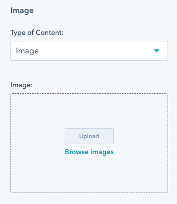
Just as you'd expect, you'll be prompted with the ability to upload an image or browse through your HubSpot File Manager. You'll notice a bunch of other cool options below. We'll get into those a little further down in this article.
Use the breadcrumb to jump back to the main column view and you'll see this.
The beauty of adding content in this new way is you can very simply drag-n-drop the elements in this list around to refine the content stacking order making endless possibilities.
That pretty much covers the very basic gist of using the Magic Module. Keep scrolling if you want to get into the nitty-gritty.
Adding a Background
One of the first things you'll likely want to do is add a background (color, gradient, image, or video). You can do this by going to the STYLES tab.
In most cases, you'll likely only want to add a background to the Section. This gives you that nice edge-to-edge look. Use the dropdown to select the type of background you want to add.
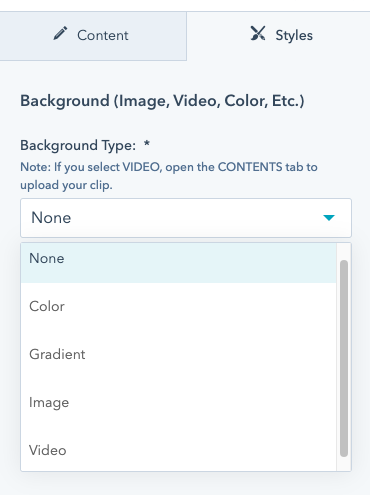
- Color:
Not much to explain here. Only use this if you want the color to be different from your default background color. - Gradient:
You'll see you now have far more options in the number of colors you can add to the gradient along with its position. Have fun! - Image:
I'm sure you've got the hang of this already. - Video:
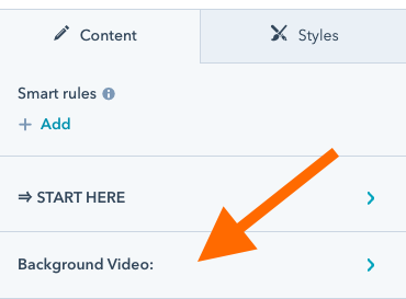
If you select a video background you'll need to jump back over to the CONTENTS tab in order to upload the video. You'll see it become available if you select this background type.
SUPER DUPER IMPORTANT: If you are using background images or video, make sure that you are optimizing these to the best of your ability. They can be one of the largest things that slow down your web page if you're optimizing for SEO on this specific page.
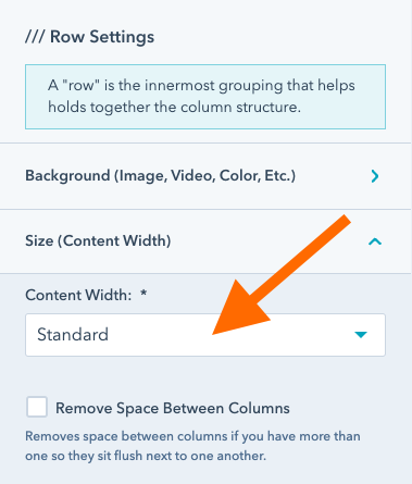
Controlling the Content (Row) Width
Should you need to modify how wide or narrow the width of your content is, you'll find this under the STYLES tab in the Row Settings. You can easily select from the dropdown to choose from your defaults or set a custom width.
Controlling the Height and Spacing
This answer isn't quite as straightforward as how to control the width since there are many variables that end up defining the height of the section. For the most part, it has to do with the height of your content and the spacing you set above and below it in both the column and row.
Let's just focus on the row in this example. You'll see the Spacing (Around Content) options.
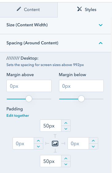
In this view, you'll see a reference to ////// Desktop but there are also options for Tablet and Mobile devices that you'll want to set accordingly. I would encourage you to do some experimentation with these options in order to see what they control and how you might use them along with the different background options you have set.
Column Design Extras
Let's talk about some fun stuff. Under the STYLES tab and any of your Column Settings, you'll notice that section that says Design Extras.
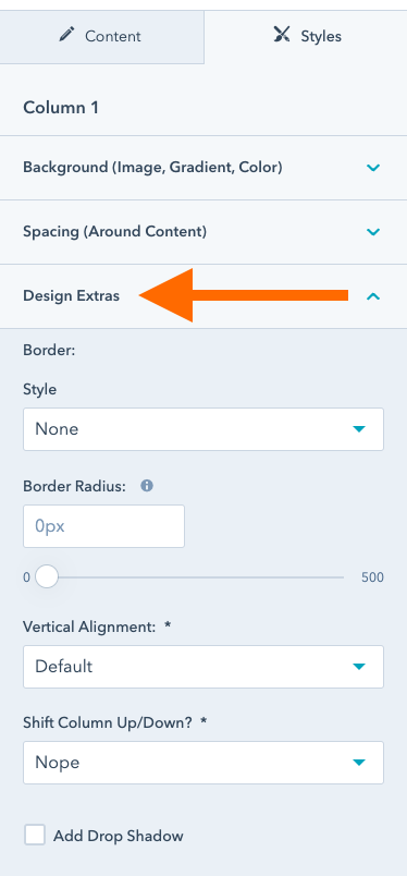
It's here where you can get a little fancy with each column. You'll have the option to:
- Add Border/Outline
Want a thin or thick color outline around the column? Boom! You got it. - Border Radius
Want the column to have rounded corners? You bet you can do this. - Vertical Alignment
Easily select where you want the column aligned. Works best when a neighboring column has more content (is taller) than the one you're using this setting for. - Shift Column Up/Down
Now we're getting fancy! This lets you move the column up or down so it overlaps the module above or below. - Drop Shadow
I'm pretty sure you can guess what this does. Now you'll have full control over all aspects of the drop shadow you add.
Adding Animations
Now you have even more control over adding a wide range of animations along with specifically controlling certain attributes such as:
- Delay
How soon the animation gets triggered once the column or piece of content is in view. - Speed
How fast the animation happens. - Repetitions
How many times do you want the animation to animate.
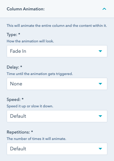
What's even cooler is that you can add an animation to an entire column or individual content elements. Just promise me you won't go nuts with animations. Subtlety is key!
Image, Icon, Lottie File Positioning & Alignment
When selecting either of these content elements you'll notice that you have control over the position with a dropdown that lets you select Left (default), Center, Right, or Specific.
Left, center, and right is pretty self-explanatory. Using a specific position is where things can get very interesting.
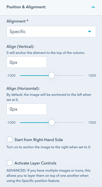
By selecting Specific the element (icon, image, Lottie) will automatically be anchored to the top-left side of the column you've added it to by default.
This is where the sliders come into play.
- Align (Vertical)
A 0px value aligns it directly to the top. Moving the slider to the right towards the positive side will shift the element down whereas moving the slider to the negative side will shift the element up and outside of the column. - Align (Horizontal)
This works exactly the same as what I mentioned above although moves the element right and left. - Start from Right-Hand Side
Turning this on moves the default position of the element to the top-right corner as opposed to the top-left. - Activate Layer Controls
This is a very advanced feature for when you have multiple elements that may overlap one another due to their specific position. This allows you to control how they are layered (their z-index).
IMPORTANT: This feature is not compatible with the Parallax Element feature in the Animation list so if you're using that feature keep this set to default, left, center, or right.
Adding Parallax Scroll to an Element
One of the cool new features introduced in the Magic Module is the ability to add the parallax scroll effect to individual content elements on the page. Basically, as you scroll down the page, you can set certain elements to move up and down as you scroll.
Here subtly is absolutely essential.
To include this, select PARALLAX ELEMENT from the Animation dropdown. This will give you the ability to set the speed and direction of the element on scroll.
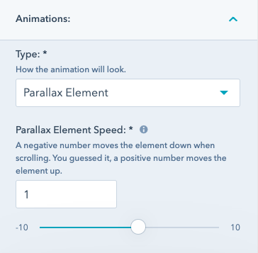
This is another feature to use with caution and do a lot of experimentation. Using the slider gives you the option to have the element move Up (positive value) or Down (negative value). This slider increments in 0.01 and that can go a long way.
Note: This feature is disabled for mobile devices or screens under 575px.
Quick Wrap Up
As I mentioned early in the article, the Magic Module is currently in beta. If you notice that anything isn't working as you would expect or you've uncovered a bug, please report those here. That would be super helpful.
If there is anything you think would be helpful to add to this article that you found was missing, don't hesitate to let me know. This is a very robust module that can well... do MAGIC! So, my goal is to keep this article as streamlined and informative as possible.
I look forward to seeing what you're able to create with it!