Here is a quick guide to everything you need to know in order to use the all-new Content Slider.
Module Status: Beta 0.1
Before we jump into how to use the Content Slider, it's important for you to know that it's currently in the beta release period.
Please report any bugs or feedback you might have here.
Let's cover some high-level basics
If you've been using the new Magic Module, you'll notice a very similar experience when using this Content Slider module.
As soon as you drag-n-drop the Content Slider into your webpage you'll notice the Slider Style Options dropdown. There are three styles to start and there could be more on the horizon. Wink, wink...
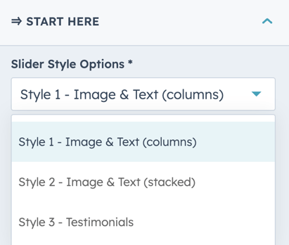
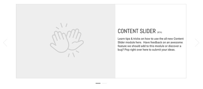
Style 1 - Image & Text (columns)
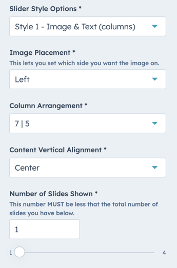
This will let you create slides with two columns. Perfect for an image on one side and text on the other.
You'll see that you can very easily choose which side you want the image on, the column ratios, content vertical alignment, and the number of slides you want to have in view at once.
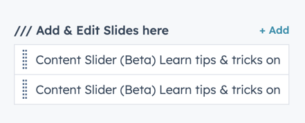
To add, slides you can simply click the +Add link.
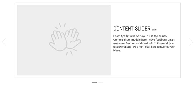
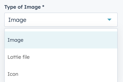
The first thing you'll notice is that Slider Style 1 allows you to select between an image, icon, or Lottie file to display next to the text.
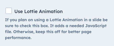
IMPORTANT NOTE: If you plan on including Lottie Files, you must turn this feature on under the Start Here section of the module.
Styling the slides
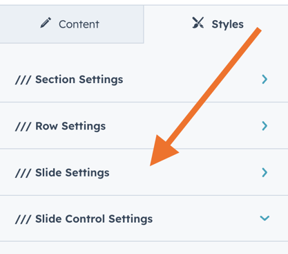
You have full control over the style of the slide itself. These options can be found under the Style Tab here.
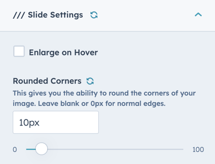
Open that up and you'll see a range of options to control the background color, border, and rounded corners.
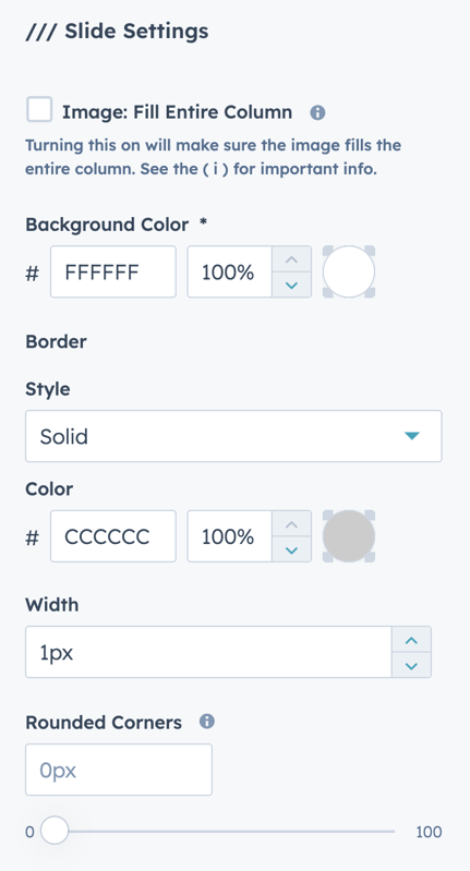
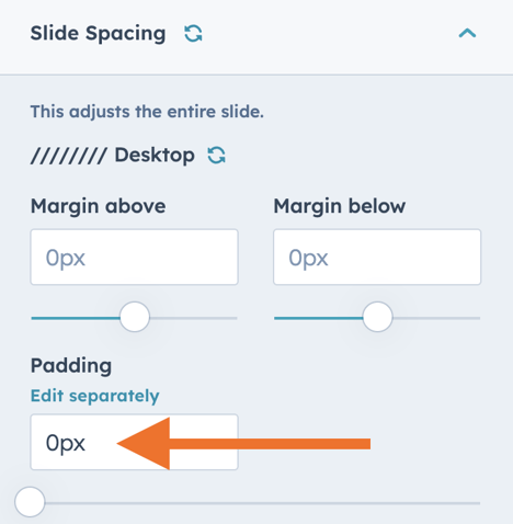
You also have the option to have the Image Fill the Entire Column so it looks like this.
When you turn this feature on there is an important 2nd step. Under the Slider Spacing options you will want to set the padding to 0px;
Style 2 - Image & Text (stacked)
This style is very versatile and works great when you want to simply slide through a variety of images like a logo scroller. It looks like this...

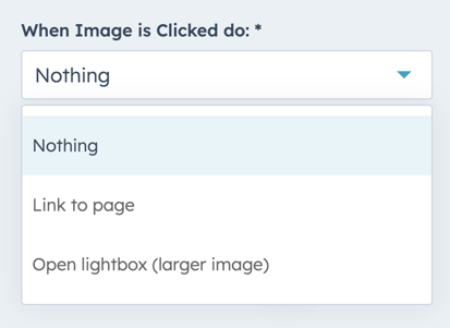
Once you drag this module onto the page you'll see that you can easily set what you want to happen when the image is clicked.
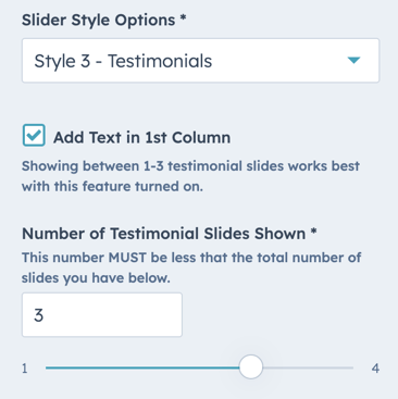
Next, you can set how many slides you'd like to show in view at once. It's important that the number of slides shown is LESS than the actual number of slides you have.
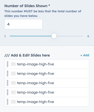
When adding/editing each of the slides, you'll also notice that you have the ability to add text below each image via the rich text editor should you want to add additional context.
Slider Style Settings
Since this is a pretty basic slider, there are just a few simple style options available.
Style 3 - Testimonials (or get creative)
Looking for a new way to add Testimonials to your CLEAN website? Then this option might just be exactly what you're looking for.
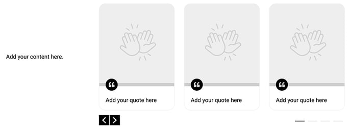
When selecting Style 3 you have the ability to add content in the first column or remove it altogether to only show the testimonials.
Editing each testimonial slide:
- Adding an image:
It's best to upload images to each testimonial slide that are the same size. They are set to fill the entire top space so having them the same size will make sure they all look consistent. - Adding quote text:
You have access to a rich text editor so you can really go wild in formatting each quote. - Edit/Change the icon:
Have an idea for a different type of card? You can easily change the quote icon to something different.
Slider Style Settings:
You've got full control over how you'd like the slides to look. Here's what you can control:
- Image Height
- Turning on/off the quote icon
- Icon Color and Background Color
- Bar color
- The background color of the slide
- Border
- Rounded corners
- The spacing around the quote text
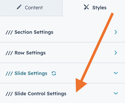
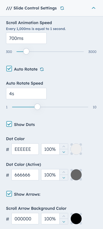
Slider Control Style Settings
You also have full control over the elements that control the slider. You can find them under the style tab.
Here are a few of the awesome options you have at your disposal.
- Scroll Animation Speed
Lets you control the actual speed of the animation when the slide is triggered. - Auto Rotate
Turning this on will automatically cycle through the slides - Auto Rotate Speed
Lets you set how much time before the slide animates to the next slide. - Show Dots
You can turn on/off the slide indicators below the slides. - Dot color options
Easily change the color for the normal and active state - Show Arrows
Allows you to turn on/off the arrows on either side of the slide - Arrow Color
If you have any questions, or feedback, or catch any bugs as you start using the new Content Slider, be sure to let us know here.